Design Operations, Systems & Patterns
Description:
Throughout my career, I have created tools to empower designers and developers. This work did not have a name until recently when Design Operations (DesignOps) was coined. DesignOps is a framework of processes, cultural norms, and tools to scale and amplify a designers' value to their organizations.
Design systems are a common element within design operations. A design system helps organizations scale their design efforts. They offer a collection of components, visual style, and other guidance. The design system is documented and released as code and design tools making teams and products more cohesive and efficient.
I have worked on design systems, style guides, and pattern libraries in all my positions. This includes Ubiquity6's Displayland, Autodesk’s Orion/HIG & BIM360 HIG, zSpace’s 3d workspace, Second Life’s Viewer reboot, Intuit’s Olmsted style guide, and Java's Swing/JLF.
Ubiquity6
At Ubiquity6, I drove multiple design systems. To reduce workflow bottlenecks, I created design team best practices for Sketch usage. To increase overall efficiency, I developed a design handoff procedure with input and buy-in from Design, Engineering, PM, and Quality. I provided training in design thinking. (Images blurred to protect Ubiquity6's IP.)
As a startup's new product, Ubiquity6's Display AR mobile app evolved rapidly. To create efficiencies for rapid iteration, I created a design system. I started with an audit of the existing application. Based on this audit, I evolved and standardized the color palette and typography. After incorporating color and type standards, components and patterns were added as the designs matured.


Modern design teams collaborate and iterate. New designers joined the team with little multi-designer collaboration experience using Sketch. I created collaborative team best practices for Sketch usage including:
- Designer Mindset
- Layer Styles / Text Styles / Symbols
- Libraries
- Version Control
- Naming Convention
- Artboard Organization
- Dummy Data (Long / Short / I18N)
(Please see my Medium article on this topic endorsed by the Sketch team itself.) Employing Sketch usage guidelines smoothed over many productivity bottlenecks in our team's workflows.


While addressing design team practices, I also reworked our design handoff process. A good design handoff minimizes guesswork and improves the implementation team's effectiveness. The new process adds a single-source-of-truth design document to the existing development workflow. This document contains pointers to graphic assets, static screen specs, interactive prototypes, and a copy spec document. Comments and edits made to the document generated notification to interested parties which centralized handoff discussions.


I led a workshop for Ubiquity6 on Design Thinking's tools for innovation and user focus. I described the high-level ideology and processes while providing specific examples of methods from the LUMA Institute. This foundation proved useful when introducing Design Thinking methods into discussions for achieving future business goals.


Autodesk
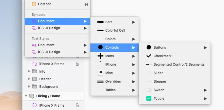
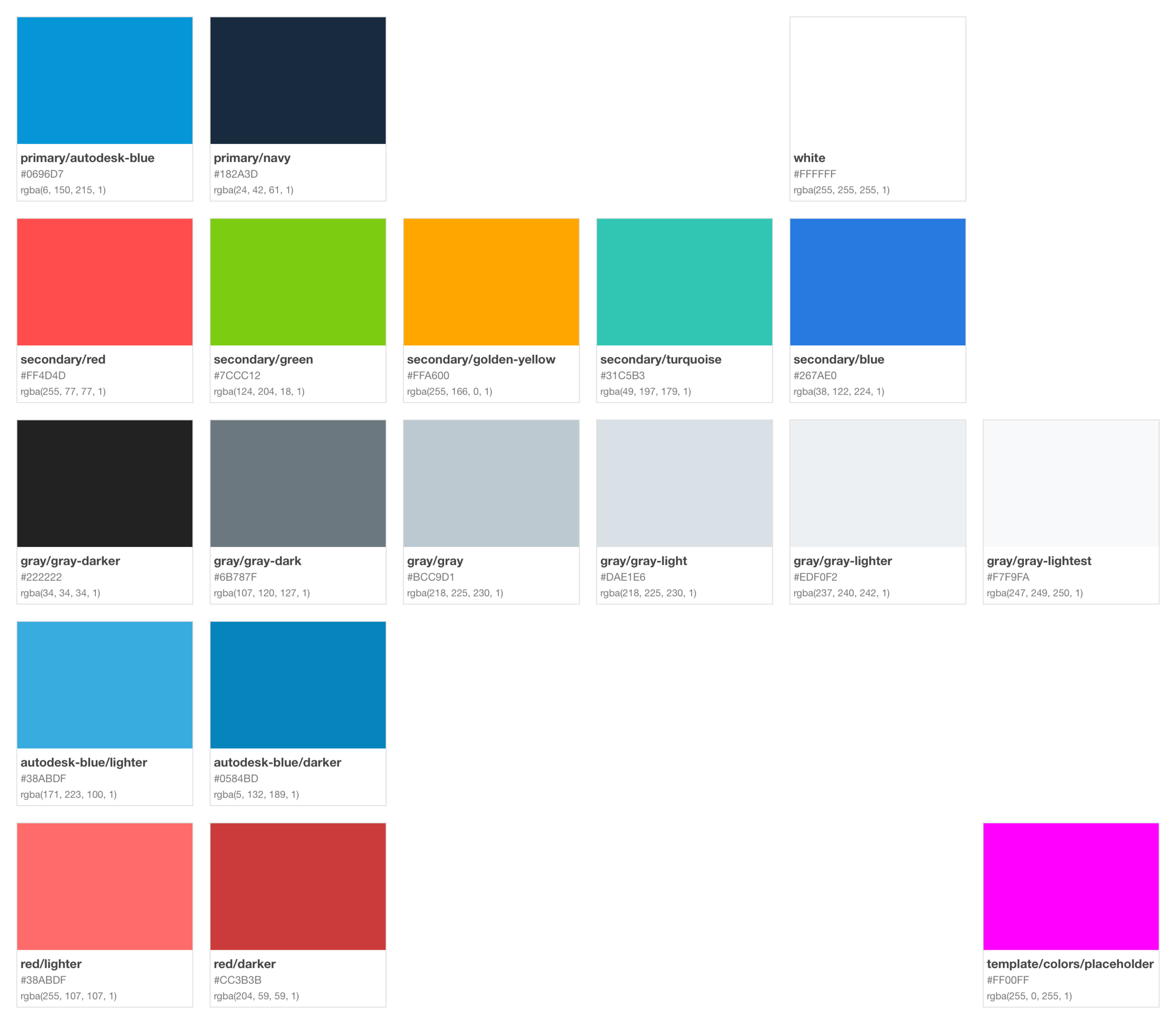
At Autodesk, I progressively iterated over a Design System embodied as shareable Sketch libraries. I introduced a version control system (Abstract) for tracking changes to the design system and designer's work. The design system libraries were delivered via Abstract and they helped geographically-dispersed design teams kept their work synchronized. The introduction of Abstract also provided efficiency, stability, and a record of design decisions.


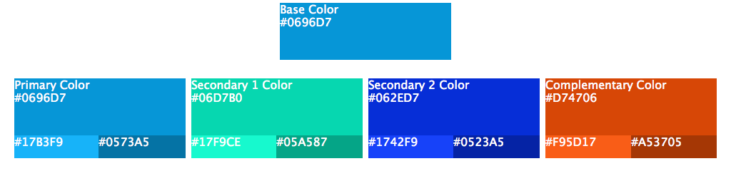
To increase efficiencies between design and development, I developed three prototype tools. The first was a Sketch plugin to synchronize color palettes between designers via export/import of JSON files. A Sketch plugin to automate graphic asset synchronization with the CI/CD framework was the second prototype tool. The third was a simple CSS color palette generator. Given a base color, the CSS color palette generator generated a primary, two secondary, and a complementary color. It also generated a lighter and darker hue for each color.


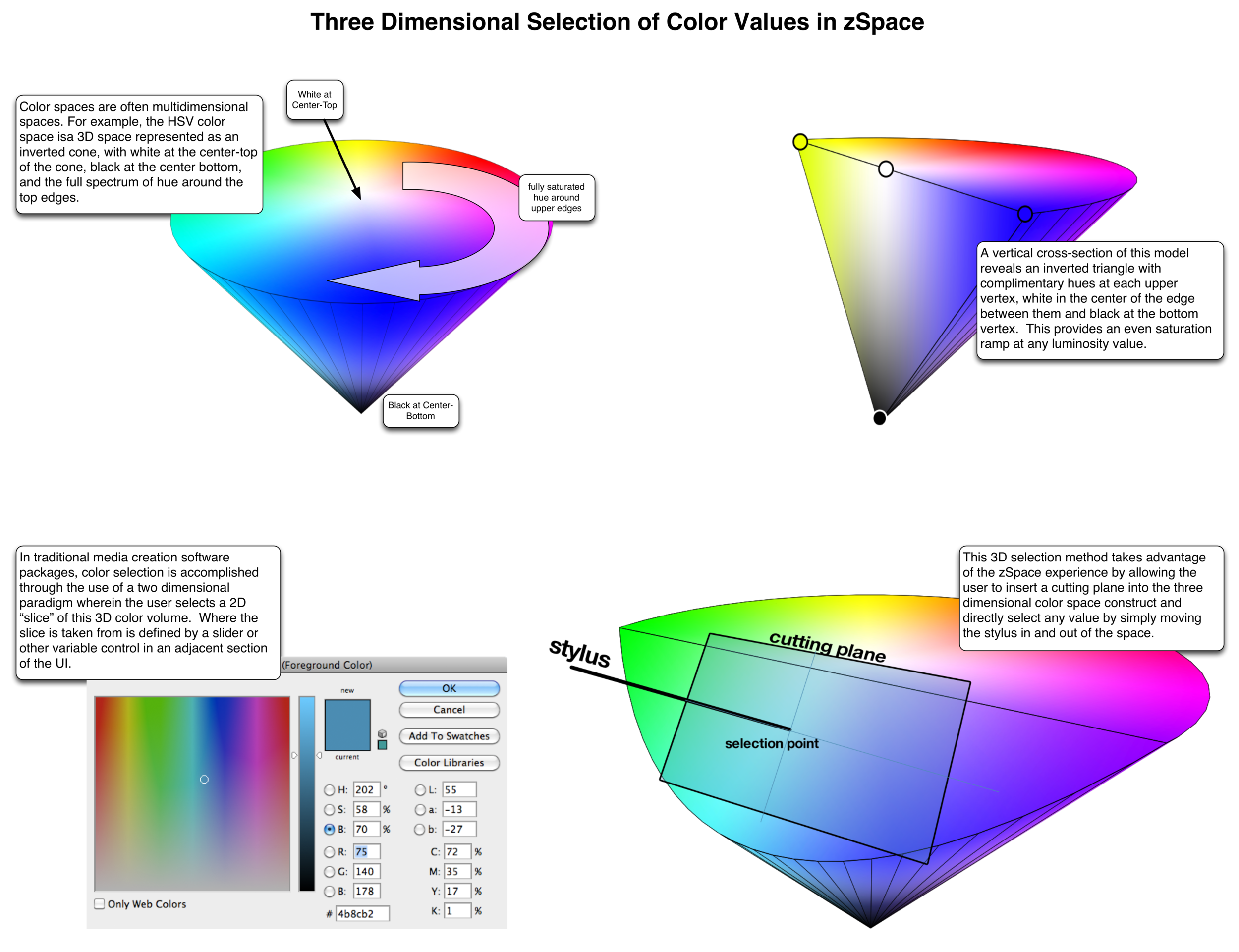
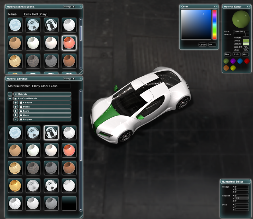
zSpace
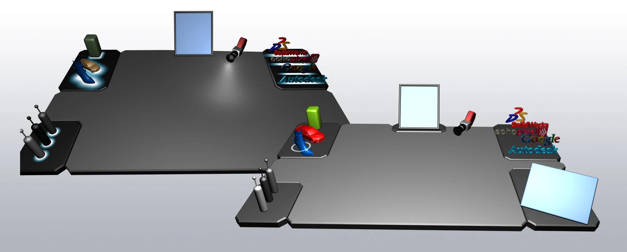
I drove the design process for zSpace's visual language, interaction model, and core tools. Utilizing prior art as inspiration, I conducted interview sessions with domain experts. The goal was to understand how people might expect 3d spaces to appear and behave. Common themes emerged:
- Translucency
- Minimalist blue/green UI controls
- Light/Glow changes for effects
- Rounded corners and edges
These themes established zSpace's core design:
- Translucency and lighting effects drove the design
- Transparent planes held together by lines of light defined working surfaces
- Blue was the primary color for UI comprised of simple lines and geometric shapes
- Different colors, glow, and translucency conveyed tool modes and states
- Dark backgrounds encouraged users to focus their attention on the content
The translucent planes provided depth cues for the 3d workspace without occluding content. As seen in the examples, experimental workspaces and tools were designed and prototyped. The pervasive use of translucency often caused performance challenges.