Ubiquity6’s Display AR App
Streamlining Augmented Reality for Enhanced User Experience
Ubiquity6 created a battle-tested and scalable server-based artificial intelligence, machine learning, and computer vision technology stack, enabling collaborative location-specific augmented reality experiences. However, the end-user mobile AR app was not suitable for consumers.
As the first Product Designer at this startup, I joined Ubiquity6 to envision a new design for our AR mobile app. Additionally, I organized our design system efforts.
To kick off the mobile app redesign, I conducted interviews with domain experts, long-term employees, and members of the executive team. Based on their input, I created proto-personas that reflected the desires and goals of the target customers. I then analyzed user flows and developed a new information architecture through stakeholder consultations and brainstorming sessions. Throughout the process, I created low-fidelity and high-fidelity wireframes and prototypes, continuously incorporating stakeholder feedback.
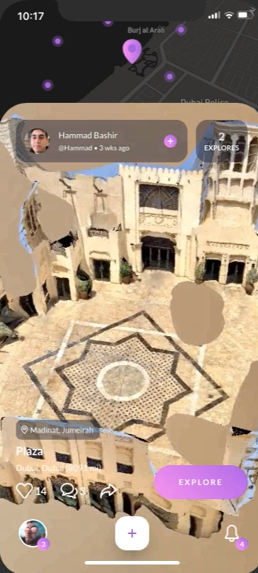
The redesigned Display AR app focused on enhancing the user experience by emphasizing quick and easy access to augmented reality play and creation.
In July 2019, we released a pilot version of the app to hundreds of hand-picked users, demonstrating positive outcomes. The beta attracted 500,000 sign-ups, but Ubiquity6 never launched a fully developed product.
Platforms: iOS & Android Mobile AR, Responsive Web
Disciplines: Design Strategy, Product Design, Mobile Design, Design Thinking, Information Architecture, Persona, Wireframing, Prototyping, Design Systems
Tools: Sketch, Abstract, Framer X, Adobe XD, InVision, Principle, LucidChart, Keynote, Affinity Photo
Problem Definition - Edit Reality Together
Ubiquity6's wants to "unlock new ways for people to connect in the physical spaces they care about" through shared collaborative virtual experiences. To achieve this, people need to create and save content in an exact location. They also need a tool to share this content with others across time.
By analyzing your phone's camera and sensor data, your device can understand the geometric structure of the world around you. With this data, you can synchronize your reality with anyone else and interact with others through your phone's camera in real-time. Information about the virtual objects and their real-world location is saved to the cloud so others can experience them over time.
In August of 2018 at the SFMOMA, 150 people took part in an experiment. Using an alpha Ubiquity6 mobile app, they created a collaborative real-time AR experience. For Ubiquity6, this was a real-world software stress test with naive users. The experiment was mostly successful. The core software infrastructure worked well, but the end-user experience was lacking.
Ubiquity6 needed to create a consumer-ready mobile application.
Hired in December of 2018, I was the first traditional Product Designer at Ubiquity6. I reimagined and redesigned the Display mobile app. I also organized Ubiquity6's design system efforts.
Redesigning Display AR
For my project work, I use an enhanced version of the Double Diamond design thinking process.
Proto-Personas
To create an exceptional mobile AR app, we had to understand our users' desires, experiences, and goals. I created proto-personas based on interviews with domain experts, long-term employees, and members of the C-suite. We used the proto-personas as a tool to align our decisions with our target customers' world view and desires.
For the near-term, we focused on the Mappers persona. We knew hobbyists who enjoyed scanning 3d objects and photogrammetry. We knew they would love a simple phone-based app for creating 3d models from real-world places. We also knew Creators and Players needed an existing collection of 3d-modeled real-world locations. But, they were unlikely to make these models themselves.
User Flow Analysis
The product design requirements called for quick, easy access to AR creation and AR play. Through stakeholder consultation and personal exploration, I created user flow analysis. The workflow diagrams show that the app emphasizes secondary features over core AR features. To optimize the user experience, I used these requirements and analysis to drive the new IA.
New Information Architecture
Design requirements and the user flow analysis drove the new information architecture.
Initial brainstorming and affinity clustering work with stakeholders helped organize feature categories.
The first draft created hard distinctions between content, browsing, and tertiary app features. Reviews with stakeholders confirmed the feature groupings. But, the review sessions called for better blending of functionality to avoid feature silos.
The final IA has a "Lobby" combining AR content browsing and interactions. This IA emphasized AR activities over app infrastructure like profiles, settings, and notifications. Animations are encouraged over screen transitions.
Wireframes and Prototypes
Lo-Fi Wireframes
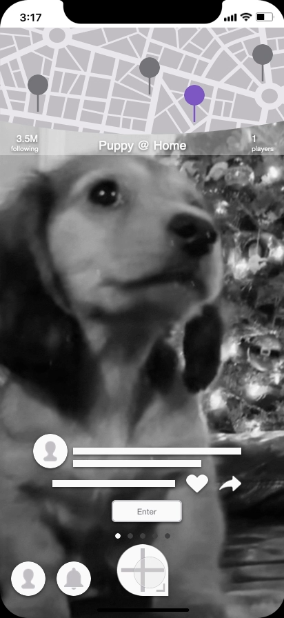
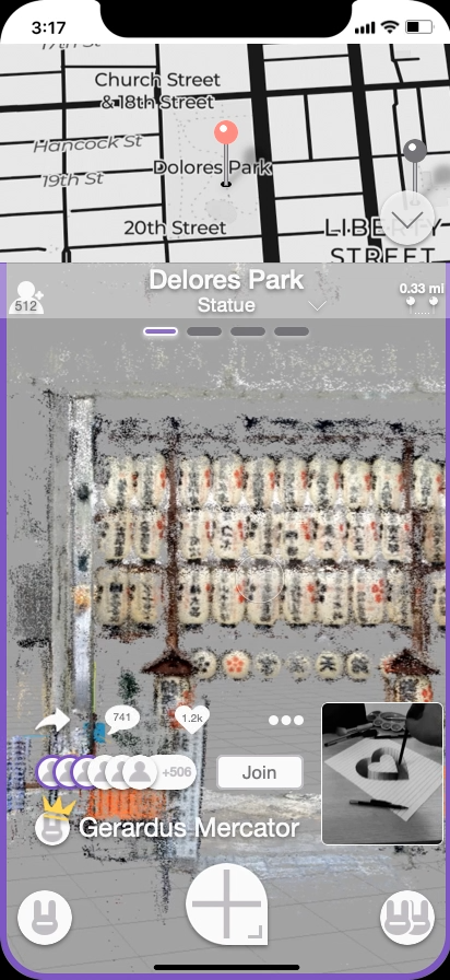
After stakeholders approved the new IA, I began low fidelity wireframing in Sketch. Reflecting the IA and grouping functionality was wireframing's early focus. The primary AR content feed provided for different styles of browsing via a map. This arrangement emphasized AR content discovery with AR content interaction.
With progress on basic design layout, interaction and motion details needed more clarity. I began low fidelity prototyping to gain insight into these design details.
Lo-Fi Prototypes
With wireframes in hand, low fidelity prototyping in Principle followed. The initial prototype tested horizontal and vertical swiping. The 2-axis swiping worked pretty well, but it was essential to experience it yourself.
This initial prototype raised questions about information hierarchy and layout. A quick discussion with stakeholders about metadata and each attribute's importance provided clarity.
The next prototype incorporated this clarity around object metadata. It was also a huge step forward in exploring map interactions and point cloud data. Live video added a heightened sense of realism.
Stakeholders were very excited about this design direction targeting the Mappers persona.
Hi-Fi Wireframes
Shifting project schedules shortened our design timelines. To help meet deadlines, I received visual design help from a remote contractor. With short iteration cycles, we made significant updates to Display's visual style and layout. We revamped our color palette, typography, opacity, shadows, iconography, shapes, and terminology.
We designed more workflows, including launch screens, onboarding, progress indicators, and error states. Design fidelity increased as did the variety of placeholder data to catch edge cases.
With a new visual design, I updated the design system I created for lo-fi wireframing. Being able to evolve the design system created efficiencies allowed us to iterate designs faster.
Hi-Fi Prototypes
High fidelity prototyping helped explore motion, animations, and micro-interactions. With hi-fi wireframes created for new workflow, I used them in the hi-fi prototypes. Combined with ongoing visual design work, a production-ready app came into focus.
I created prototypes using Sketch, Adobe XD, and Framer X. Various prototyping tools were evaluated to see how they handled different design challenges.
Since all screen design occurred in Sketch, the Sketch prototype included all workflows. This prototype was great for seeing the whole app. The downsides of the Sketch prototype were:
simplistic options for screen transitions
no support for animations, microinteractions, videos, or live maps.
Adobe XD provided more options for transitions, animations, and microinteractions. There was no support for video. As imported Sketch assets needed manual fixes, I used a select set of screens in the prototype.
JavaScript and React provide the foundation for Framer X. It presented the steepest learning curve but provided enormous opportunities. Via plugins, live videos and maps were trivial. This environment offered complete control over transitions and microinteractions. But, Sketch assets needed rework to fit into the code-based environment. The prototype contained only a partial walkthrough of the app.
Business Impact
Hundreds of hand-picked pilot users used a pilot version of the app in July 2019. The proto-personas were an invaluable tool in selecting these users, who provided positive and actionable feedback. The beta product drew 500,000 sign-ups, but Ubiquity6 never launched a completed product.
Addendum - Design Systems and Team Processes
At Ubiquity6, I drove our design system and updated it through many iterations. To reduce workflow bottlenecks, I created best practices for Sketch use by the design team. To increase overall efficiency, I developed a design handoff procedure with buy-in from Design, Engineering, PM, and Quality. I provided training in design thinking.
Design Systems
As a startup's new product, Ubiquity6's Display app evolved rapidly. To create efficiencies for rapid iteration, I created a design system. I conducted an audit of the existing app to extract the current color palette and typography.
Based on this audit, I evolved and streamlined the color palette and typography.
As the app's design direction matured, the design system included components and patterns.
Sketch Best Practices for Teams
Modern design teams collaborate and iterate. New designers joined the team with little collaborative, multi-designer Sketch experience. I created collaborative team best practices for Sketch usage, including:
Designer Mindset
Layer Styles / Text Styles / Symbols
Libraries
Version Control
Naming Convention
Artboard Organization
Dummy Data (Long / Short / I18N)
Employing Sketch usage guidelines smoothed over many productivity bottlenecks in our team's workflows.
(Please see my Medium article on this topic endorsed by the Sketch team.)
Design Handoff
While addressing design team practices, I reworked our design handoff process. A good design handoff minimizes guesswork and improves the implementation team's effectiveness.
I added a single-source-of-truth design document to the existing development workflow. This new design document contained pointers to:
graphic assets,
static screen specs,
interactive prototypes, and
a copy/text specification.
Comments and edits made to this material generate a notification to interested parties. These notifications from a single document helped centralize handoff discussions.
Training in Design Thinking
I led a workshop for Ubiquity6 on design thinking as a tool for innovation and user focus. I started by describing design thinking's high-level ideology and processes. I then dove down into specific examples of methods from the LUMA Institute. This foundation proved useful when using these methods during discussions on business goals.


