Future State Prototype
Driving Alignment and Inspiration for Strategic Product Efforts
I was the design lead for Blue Shield's "Find a Doctor" feature. It was Blue Shield's most used feature, where patients search for all medical services, such as primary doctors, specialists, pharmacies, dentists, optometrists, and medical devices. Due to feature scope overlaps, I was simultaneously involved in the Digital 2.0 strategic transformation project driving long-term enhancements. However, the Digital 2.0 teams struggled to gain traction due to conflicting stakeholder goals and constraints.
I collaborated closely with my design and product management colleagues to break the Digital 2.0 team's gridlock and create momentum by leveraging my design leadership, design thinking, and prototyping expertise.
To understand the problem space and identify potential solutions, I leveraged and combined the user research, market analysis, and competitor analysis from my "Find a Doctor" work and Digital 2.0's preliminary efforts. I uncovered several common pain points hindering progress, including:
limited provider details
an inferior mobile experience
inadequate search tools
Based on my findings, I developed a UX Vision Prototype to embody the desired user experience visually. By incorporating realistic provider data, AI-based personalization, and adherence to healthcare constraints, the prototype encompassed several crucial elements, including:
personalized and contextually relevant experiences for users seeking healthcare options
a mobile-first design approach to cater to the increasing number of mobile users
enhanced provider profiles, search capabilities, and personalized experiences
My UX Vision Prototype showcased my ability to drive alignment, inspire teams, and create user-centric solutions as a product designer.
It yielded several key significant results, positively impacting the strategic product efforts. The leadership team enthusiastically responded to the UX Vision Prototype's innovative ideas and solutions. Specifically, it demonstrated the power of personalization and data-driven experiences in improving user engagement and satisfaction. While the Digital 2.0 project did not significantly impact our process, the UX Vision Prototype inspired designers and product managers. It became a valuable reference point, guiding subsequent design and product decisions in other projects, thus extending its influence beyond the immediate scope.
This case study highlights my ability to navigate complex challenges and drive alignment in strategic product initiatives. I successfully broke through obstacles, presented innovative solutions, and inspired teams to deliver user-centric experiences.
Platforms: Mobile, Responsive Web
Disciplines: Design Strategy, Product Design, Mobile Design, Web Design, Design Thinking, Information Architecture, Wireframing, Prototyping, Design Systems, Design Management, Project Management
Tools: Sketch, Abstract, InVision, LucidChart, Keynote, Affinity Photo, JIRA, Confluence Wiki
A UX Vision Prototype for a Strategic Project
At the intersection of the Digital 2.0 project and the "Find a Doctor" Uplift work, the "Future State Prototype" was developed to revitalize and focus the Digital 2.0 effort. Digital 2.0 was a collective effort across various teams to tackle functional inadequacies and inefficiencies across our product lines, while the "Find a Doctor" Uplift work focused on enhancing the profiles for medical services as part of the broader "Find a Doctor" section of Blue Shield of CA's website. To provide a clearer picture of the evolution of this project, let's examine these topics in the following order:
Blue Shield's Find a Doctor (FAD) functionality
The FAD Uplift work
The Digital 2.0 project
The Future State Prototype
Find a Doctor
Blue Shield's "Find a Doctor" (FAD) features aim to "connect members with trusted providers to meet their health and wellness needs." It offers various services, such as finding doctors, specialists, pharmacies, facilities, vision, urgent care, mental health services, medical equipment, and alternative medicine.
In 2018, FAD had over one million searches, increasing to over three million in 2019. Usage was not evenly distributed over time, with a FAD search occurring every 3 seconds during the annual open enrollment period.
Despite its popularity, FAD was the most disliked feature of Blue Shield's website, with a satisfaction score of only 17%. In addition, over half of its users reported difficulties using FAD, making it the most frustrating Blue Shield experience.
According to user experience research (NPS Surveys), market research, and competitor analysis, the most significant pain points in FAD's UX were:
Limited and poorly organized provider details
Substandard mobile experience
Inadequate search tools.
FAD underwent various UX upgrades, including minor provider profile updates, federally-mandated changes to Primary Care Physician (PCP) selection, and search optimizations for authenticated users. However, these changes didn't substantially improve the FAD user experience.
As a result, the whole product team, including user experience, program management, and development, realized that a more strategic and holistic approach was necessary to make a tangible impact on the FAD user experience. Therefore, the team stepped back, set goals, priorities, and timelines, and secured data-backed buy-in from leadership for the FAD Uplift project.
Find a Doctor Uplift
Goals, Work Areas, and Metrics
The primary goal of the Find a Doctor Uplift project was to "empower users and meet their desires to find medical resources such as PCPs and specialists by allowing them to compare and filter by various criteria such as condition and health plan."
To address the poor mobile experience, we transitioned the design work to mobile-first.
One aspect of the effort involved merging multiple provider information databases to increase the data available per provider. While this change addressed the lack of adequate data per provider, it exacerbated the poor organization of the providers’ profiles.
Another component of the project was to enhance search capabilities by implementing natural, Google-like language search. However, we could only include synonyms and fuzzy search terms due to implementation constraints.
Lastly, we designed personalized experiences for authenticated members and a streamlined-but-generic experience for non-authenticated users to address business leadership's request for differentiated user journeys.
By implementing these changes, we aimed to improve the satisfaction score of Find a Doctor by +20 points.
Provider Profile Work
To improve the provider profile experience, we set three goals:
Optimize the layout
Enhance organization and consistency
Increase user confidence in provider selection
To build a better foundation of knowledge, we conducted a variety of research activities, including:
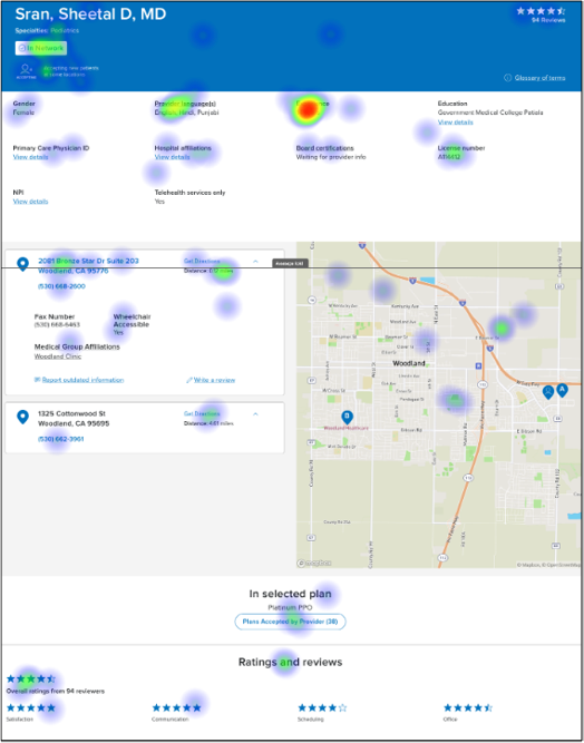
Task-based usability studies on our current profiles and seven competitors' profiles with target users
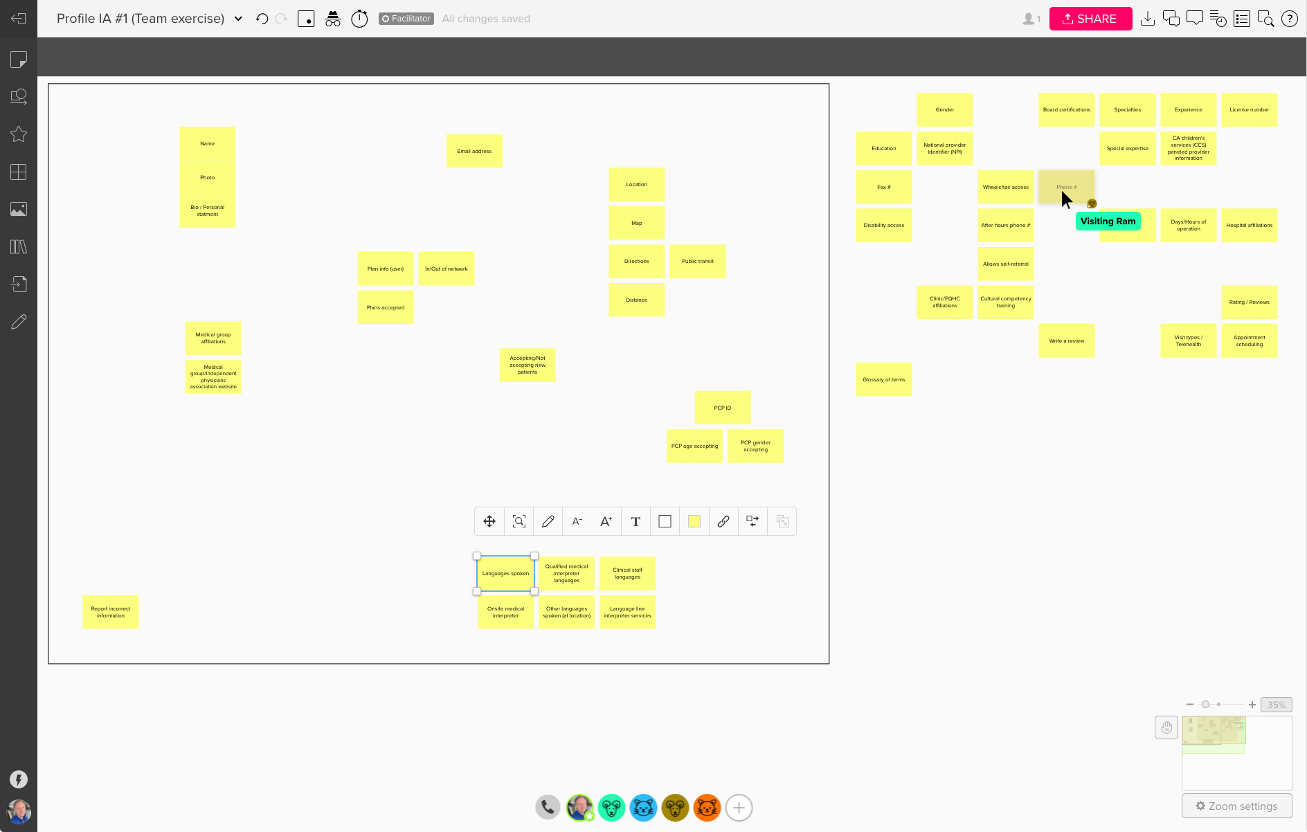
Design thinking exercises, such as card sorting, dot voting, and Rose-Thorn-Bud, to drive information architecture options with internal leadership
While the FAD Uplift project was underway, the Digital 2.0 project was founded, which overlapped our efforts and required our partial attention and assistance.
Digital 2.0
Digital 2.0 Healthcare Ecosystem
The Digital 2.0 project, a significant, cross-organizational effort, aimed to provide "integrated, data-driven, intuitive, and guided experiences" across the healthcare ecosystem. It overlapped with the FAD Uplift project in provider-generated data, patient-generated clinical data, and health and wellness data.
The core Digital 2.0 product team had three priorities for Blue Shield leadership to champion:
Committing to re-platforming
Prioritizing and investing more in the mobile app experience
Supporting a digital operating model
Re-Platforming
“Our current platforms do not support the modern interaction that we expect in the 2.0 vision.”
The existing technology stack did not support the desired future experiences. Therefore, re-platforming was critical for the Digital 2.0 vision to provide the necessary foundation for "integrated, data-driven, intuitive, and guided experiences."
Mobile
"We need to be where our members already are — mobile. We are not taking advantage of all the opportunities that mobile offers. We need to be more strategic on what is appropriate for a mobile experience vs the web."
Embracing mobile was crucial for engaging more effectively with a broader market. The Digital 2.0 project aimed to prioritize and invest in the mobile app experience, an undervalued area for Blue Shield.
Operating Model
"Aligning priorities and establishing ownership, processes, and timelines is critical for a successful digital transformation across 40 concurrent projects."
Seamless cross-organizational collaboration was crucial to the success of the Digital 2.0 project. Without an agreed-upon model for collaboration, the effort would be ineffective, wasteful, and unlikely to produce a product that matches the project's vision.
Digital 2.0 Gridlock
After the project kick-off, the different product teams continued with their specific work tasks, which failed to incorporate the Digital 2.0 vision, resulting in inconsistent experiences across product teams. In addition, the lack of consensus on the operating model needed for project alignment was a significant concern, causing the project to stall and become fragmented. Lacking foundational processes or a north star to guide discussions, various ad hoc groups discussed the operating model for months without making substantial progress.
Future State Prototype
The FAD Uplift and Digital 2.0 projects had significant overlaps in scope and personnel, providing the FAD team good visibility into the Digital 2.0 project. In FAD Uplift, we could see that project had reached a standstill due to lacking a tangible asset to facilitate discussion, feedback, and decision-making.
To provide a jolt to the stalled process and drive discussions, I proposed to my PM partners that I create a prototype utilizing the FAD Uplift work and expanding upon it with the Digital 2.0 project goals. Specifically, this Future State prototype would retain the FAD Uplift goals, including better organization for provider details, focus on the mobile experience, and enhanced search tools. Additionally, it would include Digital 2.0 goals such as integration, data-driven functionality, intuitive design, and guided experiences. I took ownership of the prototype, with occasional assistance and thoughts from the FAD product, visual, and content designers. In addition, I provided updates and reviews to the PMs on an ad hoc basis.
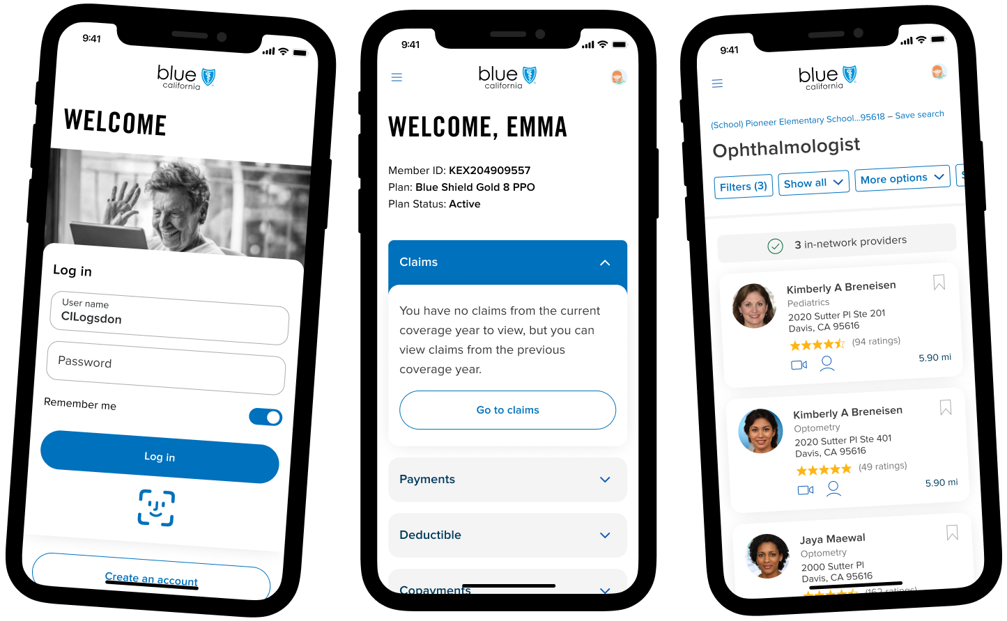
The prototype was not a conceptual piece or a UX specification. Rather, it was a concrete example of how Blue Shield can leverage data to offer its members and customers better, more personalized, and contextually relevant experiences when exploring healthcare options. The prototype narrates a human-centered story that focuses on improving users' lives by:
Prioritizing real-world tasks and goals
Incorporating realistic provider data
Adhering to existing healthcare, legal, and compliance constraints
Emphasizing mobile-first design principles
Utilizing AI-based personalization for user journeys
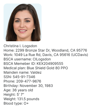
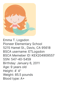
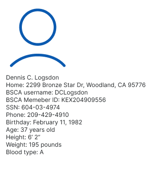
I created a scenario featuring the Logsdon family, including Christina (a 35-year-old mom), Emma (her 9-year-old daughter), and Dennis (Christina’s 34-year-old husband). It occurs on a typical workday when Christina and Dennis are at work, and Emma is in school. Just before lunch, Emma's school nurse calls Christina to inform her that Emma has contracted pinkeye.
To address the situation, Christina must pick up Emma at school and take her to the nearest available and appropriate medical care. The Logsdons are on the "Blue Shield Gold 80 PPO" health care plan, and each family member has a Blue Shield account with personal and medical information saved within it. Though pinkeye isn't an emergency, Christina should address Emma's urgent condition immediately. Emma has a primary pediatric physician, but Christina would prefer a specialist if one is readily available.
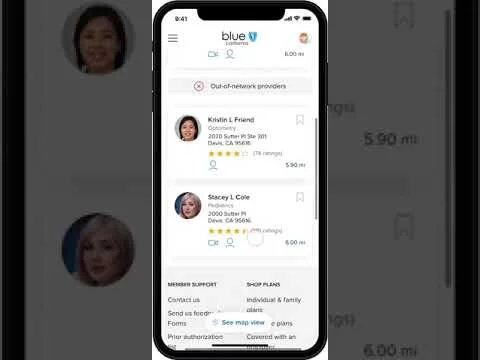
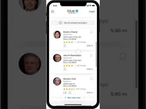
I created two user workflows to highlight the essential aspects of these streamlined, guided interactions. The first video showcases a personalized Member experience for Christina, who logs in to her Blue Shield account. In contrast, the second video showcases an efficient-but-general experience for non-authenticated users, as Christina uses the Guest option here.
Future State Prototype details
iPhone Home screen & Log In screen
The Member and Guest workflows share identical iPhone Home and Login screens.
However, for the Member workflow, Christina uses the biometric authentication system (Face ID) to log in, which was not an option in the existing Blue Shield experience. In the Guest flow, Christina selects the "Continue as guest" option for the Guest workflow.
Landing screen
Christina's Member Landing screen and the Guest Landing screen are similar to the current experience. For a Member with more than one person on the same medical plan, there's an option to view data and search for medical care as a family member. In this case, when Christina switches to Emma's account, the Landing screen changes to show Emma's Landing screen.
The Member and Guest workflows use the same Quick Access menu to navigate to the "Find healthcare" functionality.
Find Healthcare
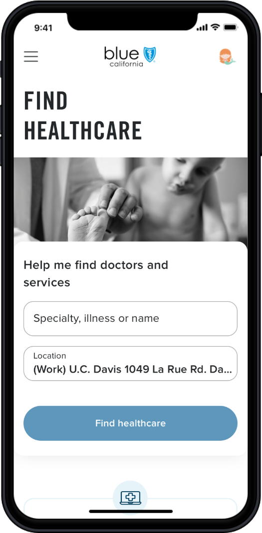
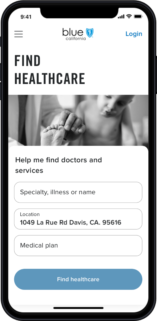
As an authenticated Member, Christina gets a streamlined experience focused on illness and location. The Guest experience requires health care plan information before it can proceed.
Location
The phone's location services provide the location for both experiences. However, for the Member experience, the system can match the current location to a Saved place. For the Guest experience, the location is a generic street address.
Health Care Plan
The Guest can provide their health care plan information by scanning their health care plan card, importing it from their digital wallet, or selecting it from a list of dozens of plan options. The prototype proposes adding the functionality to scan a health care plan card and to add/retrieve the health care plan card to the phone's digital wallet. In the existing experience, the Guest user has to choose their plan from a list.
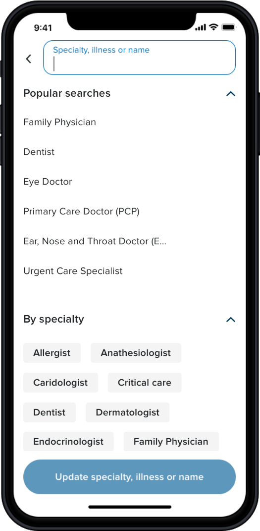
Specialty, Illness or Name
In the existing experience, the user searches by a doctor's specialty or name. However, user research and feedback indicate that these two options were not effective or satisfactory. Instead, a person's health condition was top-of-mind for the user and their preferred type of search term.
The Member is shown various options without a search term, including recent searches, saved searches, popular searches, common specialties, and common illnesses. The system bases these suggestions on its knowledge of Emma, Christina, and the overall user population. The Guest's recommendations, lacking personal background information, are based only on the general user population and do not include recent or saved searches.
When "Pinkeye" is entered as the search term, the enhanced Google-like search engine employs synonyms and fuzzy search to cull and focus the results. Again, incorporating the information about Emma, the Member's hits are more valuable than the Guest's results.
However, both provide the Ophthalmologist specialty which the user chooses.
With all the required data provided, the user can now find the nearest available and appropriate medical care for Emma’s pinkeye.
Search Results
Previous FAD Uplift user research informed the layout and information presented in each provider's card. While both Member and Guest results are similar, the Member's default results are more precise and valuable due to the additional filters the system can apply.
Filters
Because Christina provided this information, the system already knows that Emma is a 9-year-old girl. Additionally, Christina prefers female doctors for Emma and has saved this preference in her account. However, in the Guest workflow, the system doesn't know to filter results to show female doctors for a 9-year-old girl, so the user must manually enter these filters.
In both workflows, the user selects Conjunctivitis as the illness.
After applying the filters, the results are now very similar, but the Guest user had to spend more time and effort to get these results. Many filters are available in the existing experience but are grouped into one large panel with many rarely used options. FAD user research studies led to the new organization of filters, with commonly used filters in a quick-access panel and less frequently used filters in a secondary panel.
Members and Guests can view the results on a map or in a list. Members can also save their searches for future reference or favorite specific providers, but Guests do not have these options, nor do they appear in the existing experience.
Impact
The UX Vision Prototype yielded significant results for the strategic product efforts.
Firstly, the leadership team responded with enthusiasm to the UX Vision Prototype. They appreciated the innovative ideas and solutions it presented, recognizing its potential to address the existing challenges and enhance Blue Shield's value proposition.
Secondly, the prototype effectively demonstrated the power of personalization and data-driven experiences in improving user engagement and satisfaction. Showcasing these benefits helped the stakeholders recognize the value of incorporating such principles into the product. This prototype highlighted the potential impact on user experience and drove alignment among the stakeholders.
Sadly, the Digital 2.0 project itself did not produce a significant impact on our process. However, the UX Vision Prototype was a crucial source of inspiration for designers and product managers. It was a reference point, guiding subsequent design and product decisions in other projects.
Furthermore, it catalyzed alignment and inspiration across individual product teams. The prototype provided a clear vision and direction, facilitating a more focused and unified approach toward product development. This newfound alignment enhanced efficiency and progress toward achieving the strategic objectives.
